RID | 2026
Bottle Label & Brand Design
RID | 2026
Label & Brand Design

Overview
Rid is a Ukrainian kvass crafted from fermented beets—naturally rich in probiotics, antioxidants, and essential vitamins. Rooted in centuries of Ukrainian culinary tradition, kvass has long been a staple of everyday nourishment and community.
My goal with this packaging and brand design was to honor that heritage through thoughtful design. Its type, color palette, and illustrations draw inspiration from Ukrainian art, poetry, and architecture.
More than a beverage, Rid is meant to be a revival. It supports the health of the gut microbiome while celebrating and reawakening a vibrant cultural legacy that has too often been overlooked
Read More
Challenges
This project challenged me to create a visual identity that both evoked Ukrainian art and culture and positioned Kvass as an appealing product for a broader English-speaking audience. It also challenged me to use the structure of the packaging as an integral part of the design, allowing it to enhance the label rather than constrain it.
Solutions
Through my research, I designed a custom typeface that drew inspiration from Cyrillic letterforms while preserving legibility for English-speaking audiences. I also incorporated architectural motifs that complemented the form of the wordmark and established a visual connection to Ukrainian culture.
Deliverables
Bottle Label (front and back)
Bottle wrapping
Wordmark

RID(Рід)
Noun
RID(Рід)
Noun
Represents a continuous chain of lineage, including both living and deceased individuals who have a shared genealogical and spiritual connection
Synonyms: Clan, kin, or lineage


Label & Tag Layflats
Label & Tag Layflats
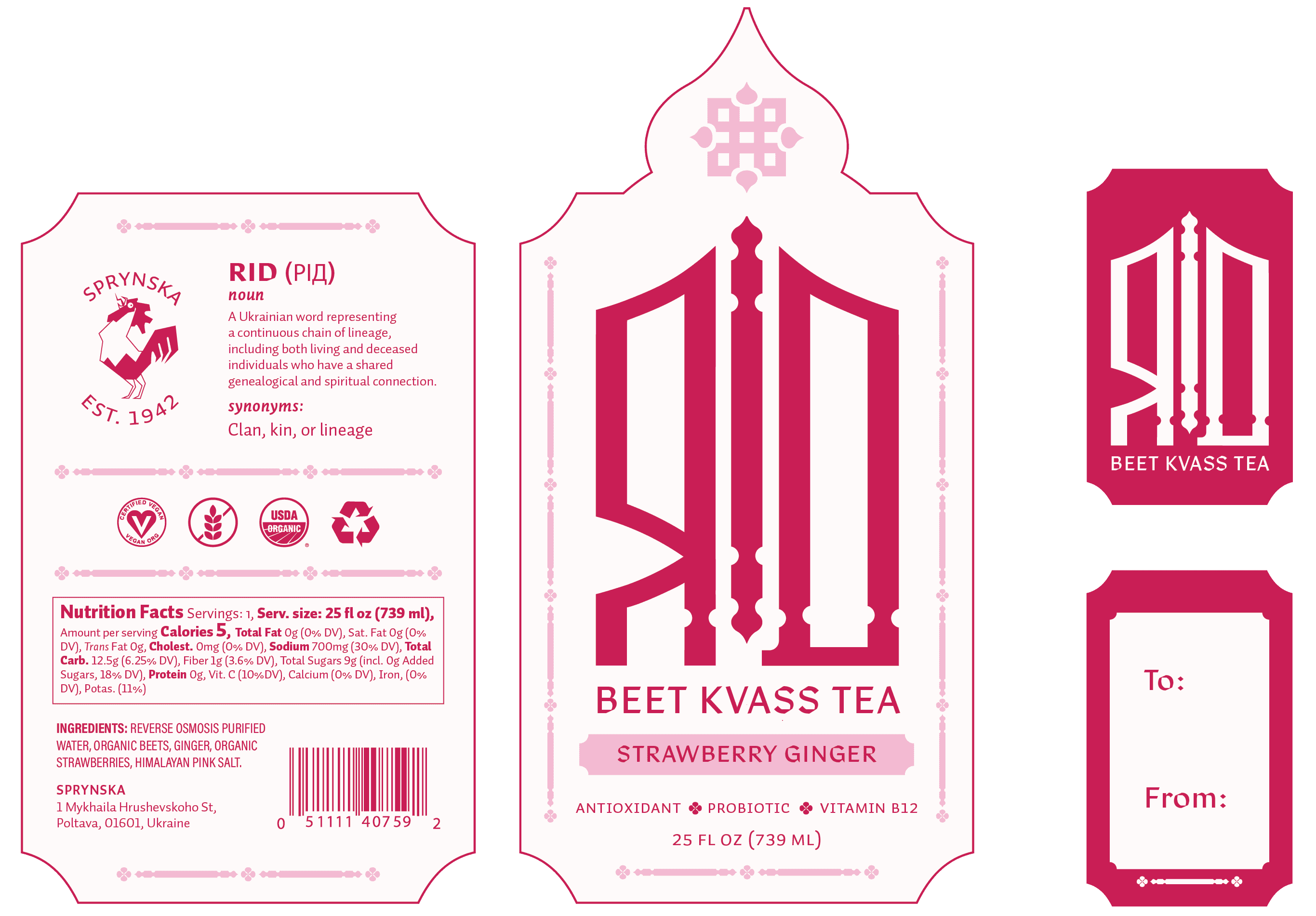
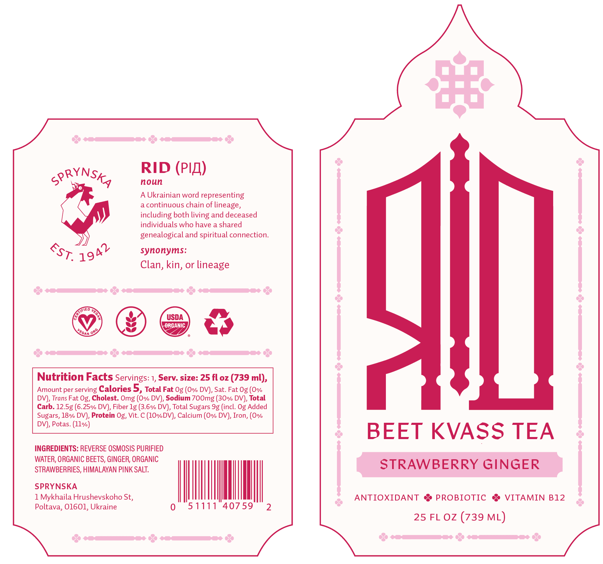


Wrap Layflats
Wrap
Layflats


Research & Moodboard
Moodboard


Overview
Rid is a Ukrainian kvass crafted from fermented beets—naturally rich in probiotics, antioxidants, and essential vitamins. Rooted in centuries of Ukrainian culinary tradition, kvass has long been a staple of everyday nourishment and community.
My goal with this packaging and brand design was to honor that heritage through thoughtful design. Its type, color palette, and illustrations draw inspiration from Ukrainian art, poetry, and architecture.
More than a beverage, Rid is meant to be a revival. It supports the health of the gut microbiome while celebrating and reawakening a vibrant cultural legacy that has too often been overlooked
Read More
Challenges
This project challenged me to create a visual identity that both evoked Ukrainian art and culture and positioned Kvass as an appealing product for a broader English-speaking audience. It also challenged me to use the structure of the packaging as an integral part of the design, allowing it to enhance the label rather than constrain it.
Solutions
Through my research, I designed a custom typeface that drew inspiration from Cyrillic letterforms while preserving legibility for English-speaking audiences. I also incorporated architectural motifs that complemented the form of the wordmark and established a visual connection to Ukrainian culture.
Deliverables
Bottle Label (front and back)
Bottle wrapping
Wordmark